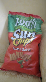
 It's late at night. i slip into the pantry for a little salty snack. i am the only one awake......until i go for the Sun Chips.
This new compostable chip bag, " louder because it is compostable," makes the most gratingly annoying crumply noise i have ever heard.
If you are on a diet, have little or no willpower, yet have asked others (and really meant it) to help you stick to it...let the Sun Chip be your default cheat.
By merely picking the bag up, you will sound off the "I'm breaking my diet" alarm and your saviors will come running.


